 WebSolvant New Delhi Web Designers and Developers Company

Responsive Web Design Look & Feel
[custom_frame_left shadow=”on”]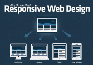 [/custom_frame_left]
The purpose of responsive design is to have one site, but with different elements that respond differently when viewed on devices of different sizes.
Let’s take a traditional “fixed” website. When viewed on a desktop computer, for instance, the website might show three columns. But when you view that same layout on a smaller tablet, it might force you to scroll horizontally, something users don’t like. Or elements might be hidden from view or look distorted. The impact is also complicated by the fact that many tablets can be viewed either in portrait orientation, or turned sideways for landscape view.
On a tiny smartphone screen, websites can be even more challenging to see. Large images may “break” the layout. Sites can be slow to load on smartphones if they are graphics heavy.
However, if a site uses responsive design, the tablet version might automatically adjust to display just two columns. That way, the content is readable and easy to navigate. On a smartphone, the content might appear as a single column, perhaps stacked vertically. Or possibly the user would have the ability to swipe over to view other columns. Images will resize instead of distorting the layout or getting cut off.
The point is: with responsive design, the website automatically adjusts based on the device the viewer sees it in.