 WebSolvant New Delhi Web Designers and Developers Company

Let’s Start Coding Our Project
The first step should be creating a layout plan for your website. Like an architect who creates a proper plan, web developers should have a good practice of creating a wireframe of your project structure.
Wireframes help establish the functionality and the relationships between different screen templates of a website.
As our website is only a static one-page website, the preferred and easy-to-develop portfolio website wireframe will look like this: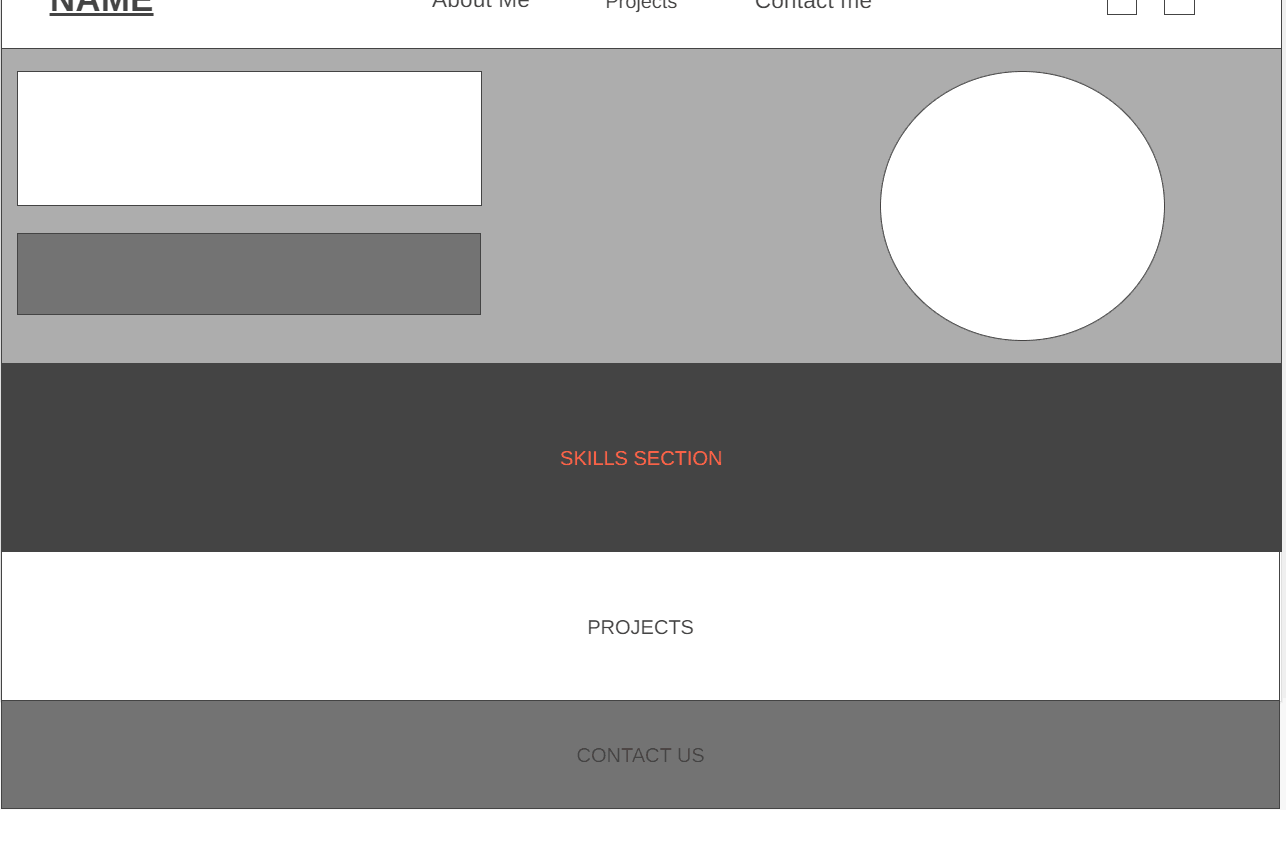 The First Section of the website is Navbar, which is on the top of the website.
Navbar:
A navbar, short for “navigation bar,” is a user interface element typically found at the top of a website or application. It contains links to the main sections or pages of the site, allowing users to navigate easily. Navbars are an essential part of website navigation and user experience design.
Let’s start coding our website
Start by creating an index.html or main.html in your project directory by clicking the add file button. This is where the HTML of the website will be stored.
The HTML code will be:
<!DOCTYPE html>
<html lang=”en”>
<head>
<meta charset=”UTF-8″>
<meta name=”viewport” content=”width=device-width, initial-scale=1.0″>
<title>Portfolio Website</title>
<link rel=”stylesheet” href=”styles.css”>
</head>
<body>
<nav>
<div class=”navbar”>
<div class=”brand”>
<a href=”#”>Name</a>
</div>
<nav>
<ul>
<li><a href=”#about”>About Me</a></li>
<li><a href=”#projects”>Projects</a></li>
<li><a href=”#contact”>Contact Me</a></li>
</ul>
</nav>
<div class=”social-icons”>
<a href=”www.linkedin.com”><img src=”linkedin.svg” alt=”linkedin”></a>
<a href=”www.instagram.com”><img src=”instagram.svg” alt=”instagram”></a>
</div>
</div>
</nav>
</body>
</html>
Explanation of HTML Code:
- The
<nav>element wraps around the entire navbar, which is a more semantically appropriate tag for navigation menus. - The
.navbarclass wraps around the brand and navigation links. - The
.brandclass is used for the branding or logo section. - The inner
<nav>element contains an unordered list (<ul>) with list items (<li>) for each link.
To download these svgs, you can visit: https://www.svgrepo.com/svg
Now click on “Go Live” in the bottom right.
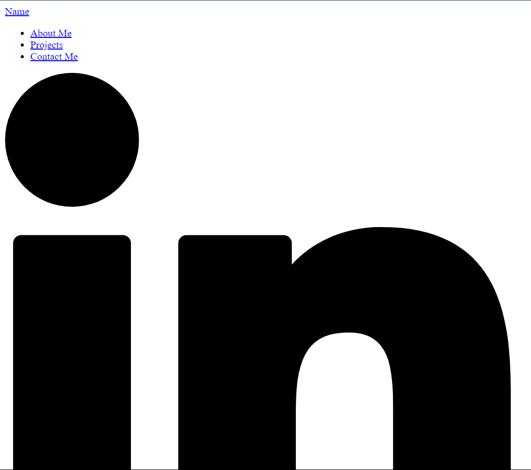
This will be the output you will be receiving on your browser.
This looks a little boring, we want it to be in a horizontal manner instead of vertical and resize svgs.
Here, CSS comes into play. HTML creates the structure, and CSS gives them the shapes and appearance.
Let’s start by creating a CSS File, styles.css.
Create a styles.css file, like we created the HTML file.
The steps we have to do are:
- Remove text decoration (the blue text, hyperlink underline, and bullet points)
- Make the navbar horizontal
- Resize the LinkedIn and Instagram svgs
- Place the components in their correct places
The styles.css will be:
body, h1, h2, h3, p, ul, li {
margin: 0;
padding: 0;
list-style: none;
}
body {
font-family: Arial, sans-serif;
line-height: 1.6;
}
.container {
width: 90%;
max-width: 1200px;
margin: 0 auto;
}
.navbar {
background-color: #ffffff;
padding: 20px 20px;
display: flex;
justify-content: space-between;
align-items: center;
}
.brand a {
font-size: 24px;
font-weight: bold;
text-decoration: none;
color: black;
}
.navbar nav ul {
display: flex;
}
.navbar nav ul li {
margin-left: 20px;
}
.navbar nav ul li a {
text-decoration: none;
color: black;
font-size: 18px;
}
.navbar .social-icons a {
margin-left: 20px;
}
.social-icons img {
width: 24px;
height: 24px;
}
Explanation of CSS Code:
-
.navbarsets the background color to a light gray (#f0f0f0).The padding: 20px 20pxadds 20 pixels of padding to the top and bottom of the navbar.display: flexmakes the navbar a flex container, allowing for flexible and responsive layout.justify-content: space-betweenevenly distributes the space between the navbar’s child elements, pushing them to the edges.align-items: centervertically centers the navbar’s child elements..brand astyles the link inside the .brand class.font-size: 24pxsets the font size to 24 pixels.font-weight: boldmakes the font bold.text-decoration: noneremoves the underline from the link.color: blacksets the text color to black..navbar nav ulapplies flex display to the unordered list (ul) inside the nav element within the navbar. This makes the list items (li) display horizontally in a row..navbar nav ul liapplies a left margin of 20 pixels to each list item (li) inside the nav element within the navbar..navbar nav ul li astyles the links (a) inside the list items (li) within the nav element inside the navbar.text-decoration: noneremoves the underline from the links.color: blacksets the text color to black.font-size: 18pxsets the font size to 18 pixels..social-icons imgsets the width and height of the images inside the .social-icons class to 24 pixels.
The output will look like this:
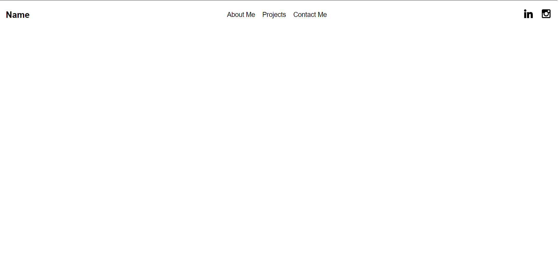 We have successfully created the first part of our website.
You can check different navbars on other websites, and take inspiration. The game is to create a navigation for the user to move through your website easily. You can do these by experimenting with different CSS properties like Flexbox, changing the sizes, margins, etc.
In the next part, we’ll start with the hero section.