 WebSolvant New Delhi Web Designers and Developers Company
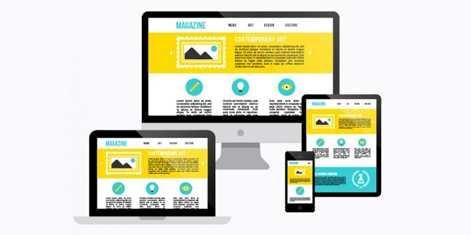
Responsive Web Design – What is this!
Have you asked yourself, “What is responsive Web design?” Responsive Web design is an approach whereby a designer creates a Web page that “responds to” or resizes itself depending on the type of device it is being seen through. That could be an over-sized desktop computer monitor, a laptop, a 10-inch tablet, a 7-inch tablet, or a 4-inch smartphone screen.Responsive Web Design has become one of the hottest trends in 2014. This is due in part to the growth of smartphones and other mobile devices. More people are using smaller-screen devices to view Web pages.
In fact, 2014 the Year of Responsive Web Design. Pete Cashmore wrote, “For those of us who create websites and services, all this leads to a singular conclusion: A million screens have bloomed, and we need to build for all of them.”
Learn More:
Responsive Web Design (RWD) is an approach to web design that makes web pages render well on a variety of devices and window or screen sizes. Recent work also considers the viewer proximity as part of the viewing context as an extension for RWD. Content, design and performance are necessary across all devices to ensure usability and satisfaction.
A site designed with RWD adapts the layout to the viewing environment by using fluid, proportion-based grids, flexible images, and CSS3 media queries, an extension of the @media rule, in the following ways:
- The fluid grid concept calls for page element sizing to be in relative units like percentages, rather than absolute units like pixels or points.
- Flexible images are also sized in relative units, so as to prevent them from displaying outside their containing element.
- Media queries allow the page to use different CSS style rules based on characteristics of the device the site is being displayed on, e.g. width of the rendering surface (browser window width or a physical display size).
- Responsive layouts automatically adjust and adapt to any device screen size, whether it is a desktop, a laptop, a tablet, or a mobile phone.
RWD has become more important as the amount of mobile traffic now accounts for more than half of total internet traffic. Therefore, Google announced Mobilegeddon in 2015, and started to boost the ratings of sites that are mobile friendly if the search was made from a mobile device. Responsive web design is an example of user interface plasticity.

Thank You for writing such a detailed article. This will surely help people like me.
Responsive Web designs are one of the keys to boost your website traffic.
Really very nice information!